Panacea
Client
Nolan Dyer
Deliverables
Brand Identity
Logo Design
Marketing Collateral
Advertisement
Project Overview
The meaning of panacea is an answer or solution for all problems. this may seem impossible, yet the members of this nonprofit takes on the challenge!
Panacea is a healthcare organization, where young professionals volunteer aid to those in need in several communities around the big blue marble. Providing a bit more TLC when it comes to their patients.
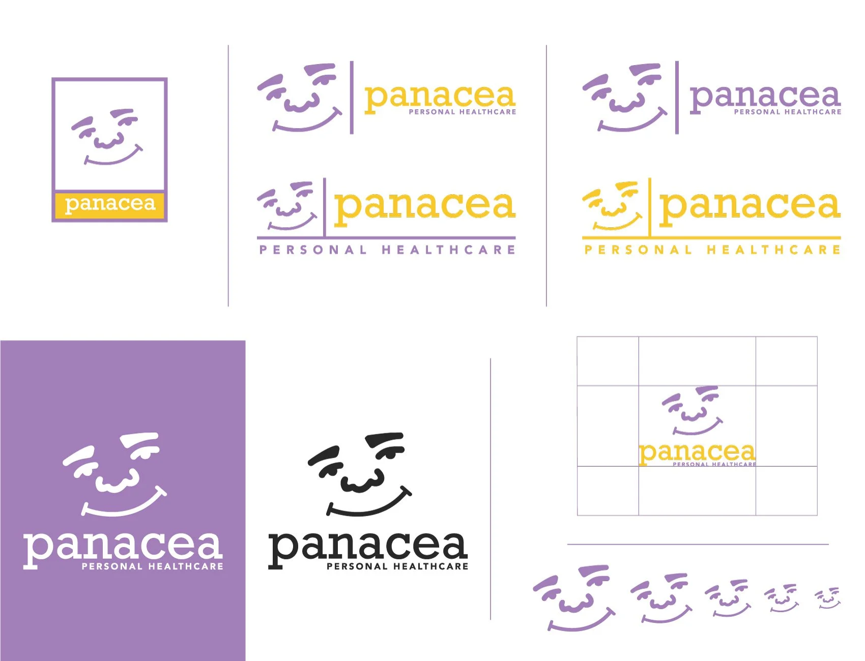
The founder came to me with just the idea of this company. They needed a whole brand identity created. He heavily implied that this free clinic was more about showing the people love and kindness and not just providing medical service. I gave them a brand that communicates the warmth of someone who truly cares.
The name Panacea was chosen, because I believe they will go above and beyond with all that is needed for one’s healing.
Slogan
The Slogan was made out of the idea that it takes more than just medicine to treat a patient. Love and comfort makes a huge difference in ones healing process.
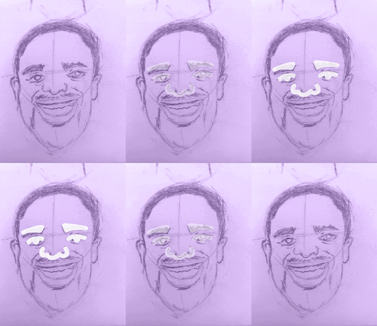
“Jamari did an amazing job creating my healthcare logo, the care, and development started from the beginning when he did an in-depth search on what you may want your logo to look like and how you want your company represented. My organization focuses on bringing healthcare to people who need it the most by leading with a smile, the logo he created encompassed our mission, it not only related to our goals of how smiling and happiness can go a long way but it also stood to represent the demographic we were serving, I will continue to go to Jamari for my marketing/logo needs and I think everyone should!”
-Nolan Dyer


