bigger Than Me Project
Client
Mel Owen
Deliverables
Logo Design
Marketing Collateral
Project Overview
The “bigger Than Me Project” is various project, that focuses on numerous ignored issues like bullying, sex trafficking, abusive relationships, and more. This movement needed a face that would spark questions and get people involved. Creating a meaningful logo was the way to give this the authentic vibe that the movement deserves.
Concept
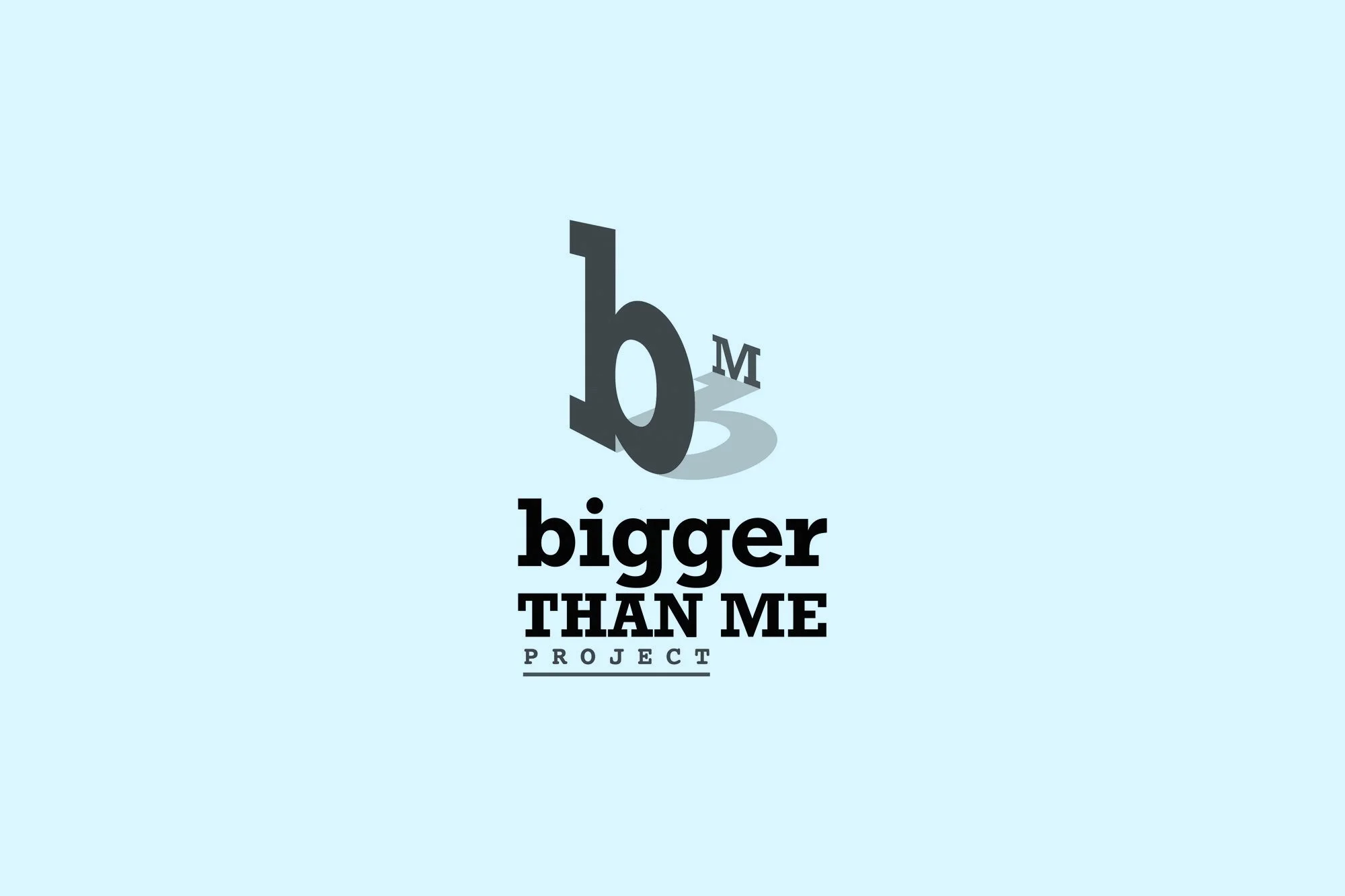
The lowercase “b” represents the elephant in the room, it’s HUGE, right where everyone can see, yet no one is paying any attention to it because they’re too focused on themselves. Like the problems, that the "bigger than Me Project" will address.
Meaning
I chose the lowercase “b” because lowercase letters aren’t as significant as their uppercase counterparts, resembling the problems the program deals with. The big issues aren’t looked upon as significant as someone’s own trivial matters (which is represented with the capital M) .
The lowercase “b” towering over the uppercase “M”, symbolizes how the problems at hand are much more severe.
“I’ve been an educator for 30 years and recently decided to develop a series of projects, that focuses on numerous ignored issues like bullying, sex trafficking, abusive relationships, and more. Therefore, Jamari made the logo symbolic, original and meaningful. Jamari’s creativity and depth for design was next level. His blend of familiarity and symbolic was genius! In addition, his customer service was top-notch! He was efficient, attentive to EVERY detail, and extremely accommodating of any request I made. I’m beyond pleased with the finished product. I can’t thank him enough!”
-Mel Owen


